May 2018
Tyumen public transportation corporate identity
Modern public transit systems should be convenient, ecological, diversified and aesthetic. We think that public transit system in Tyumen, Russia should be turned into an attractive alternative to a personal vehicle. Aesthetic and ergonomic visual communication of public transit system – strong move to the right direction.
We developed an identity of Tyumen public transit system. Our team designed different surfaces and explained the process of interaction between logo, brand graphics and environment.
For this project we used Neris font (credits to Eimantas Paskonis). Thank Ivan Boiko (Icons8, SEO) for the icons.
We developed an identity of Tyumen public transit system. Our team designed different surfaces and explained the process of interaction between logo, brand graphics and environment.
For this project we used Neris font (credits to Eimantas Paskonis). Thank Ivan Boiko (Icons8, SEO) for the icons.

Before developing we studied history of Tyumen transport, researched the context in Tyumen and took into account the global analogues.


The symbol implies roads, paths, routes. "T" is Tyumen. "T" is transport.

Replacing the color and description makes a whole logo system.

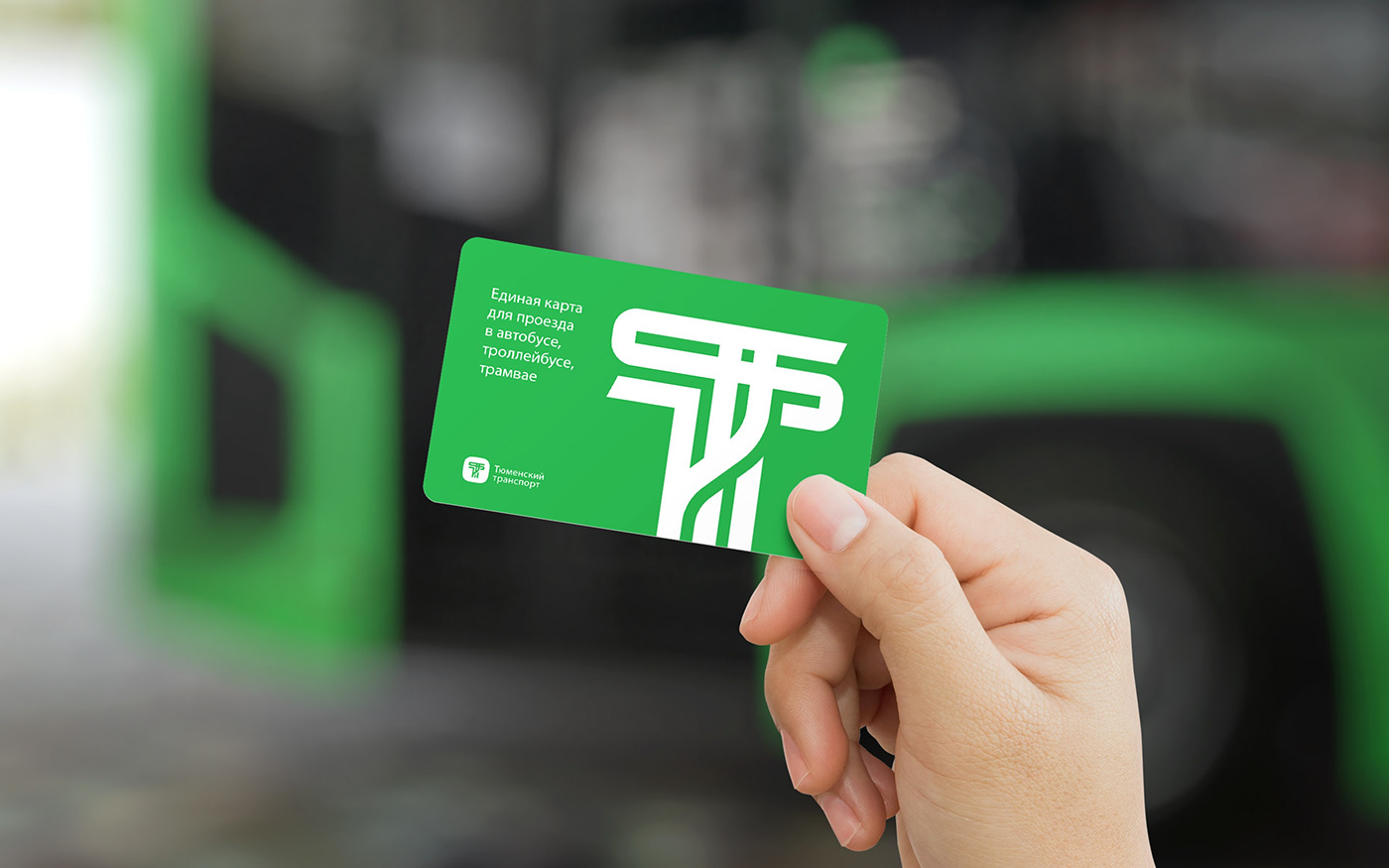
We designed universal payment cards of public transit, parking and renting.

Options of placing necessarily communication elements.


Original pattern unfolds roads and transportation theme.

Getting up the seats with the pattern. Lovely seats!

Most important places in town (train stations, museums, theater) and most recognizable spots are presented as 3D objects on the scheme.


Examples of formatting.

Vividly way of notifying of public transit news in Tyumen.

There's no way somebody wants to take it off.

Branded bracelet for wireless payments, pins and bag.